Solo cup brand refresh

___01
overview
create a cohesive brand and digital presence for an iconic cup
UX
Visual Design
Brand Strategy
Art Direction
marketing and communication
Solo Cup / Dart Container
three months
team
role
timeframe
client
___02
goals
increase sales indicators
eCom visits by 10%
have a least 100 store locator sessions a month (new)
coupon downloads up by 5%
increase brand loyalty indicators
swag ATC
general sweepstakes entrants up by 10%
newsletter sign ups by 5%
increase engagement
page views by 20%
time spent on blog posts up 15%
___03
design process / decisions
As the lead designer (both visually and UX) for the SOLO consumer brand website I spent a lot of time evaluating the current SOLO brand and how to incorporate the full product portfolio. I reviewed the SOLO personas and Google Analytics data to see who was visiting and on which devices. Most people visit on mobile, so I made sure I started with mobile designs and then added features to the tablet and desktop versions that were appropriate.
visual identity
colors
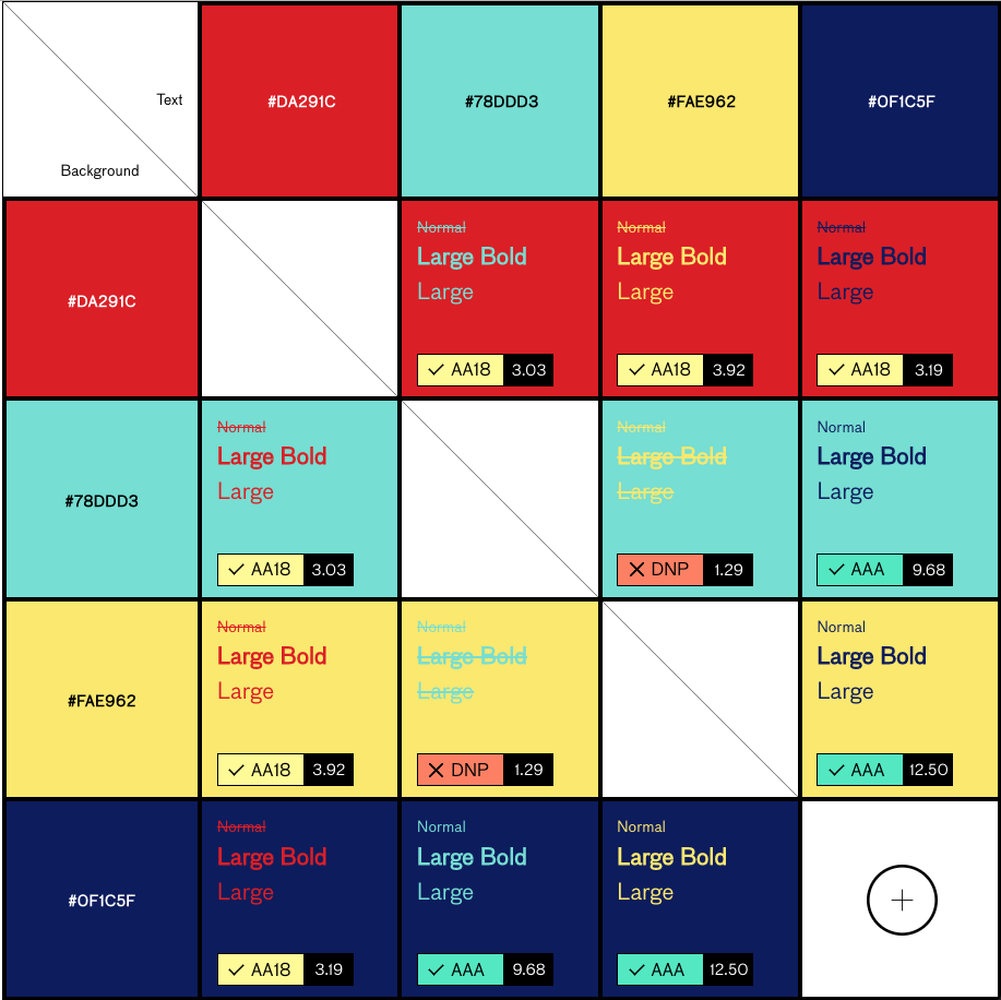
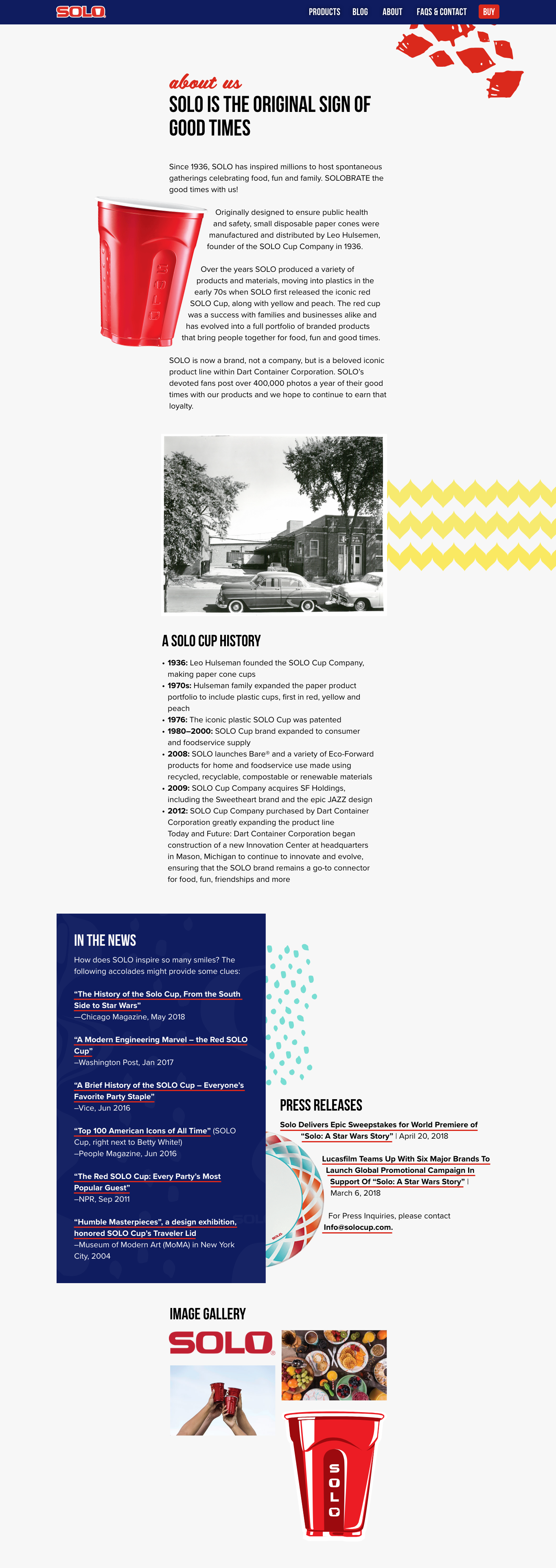
For the digital brand refresh, I reflected on the colors and “feel” of the SOLO brand. SOLO is meant to be fun and lively. However, the use of mostly black and red of the web properties didn’t lend to those emotions. Additionally, the work the social team was producing looked different than the website as well.
To enhance the lively nature of the brand I wanted colors that enhanced red, but I didn’t want the colors to become harsh, aggressive, or overly gendered. That’s where yellow and two shades of blue come in. The navy grounds all the colors without becoming drab—and adds little patriotic undertones, since the company is US owned and operated. The teal and yellow make the iconic red pop with their high contrast.
They still need to be ADA compliant, so I used a couple of online tools to check their contrast ratios. I finessed all the colors to make sure red could be used with any of them at the minimum ADA requirements.
fonts
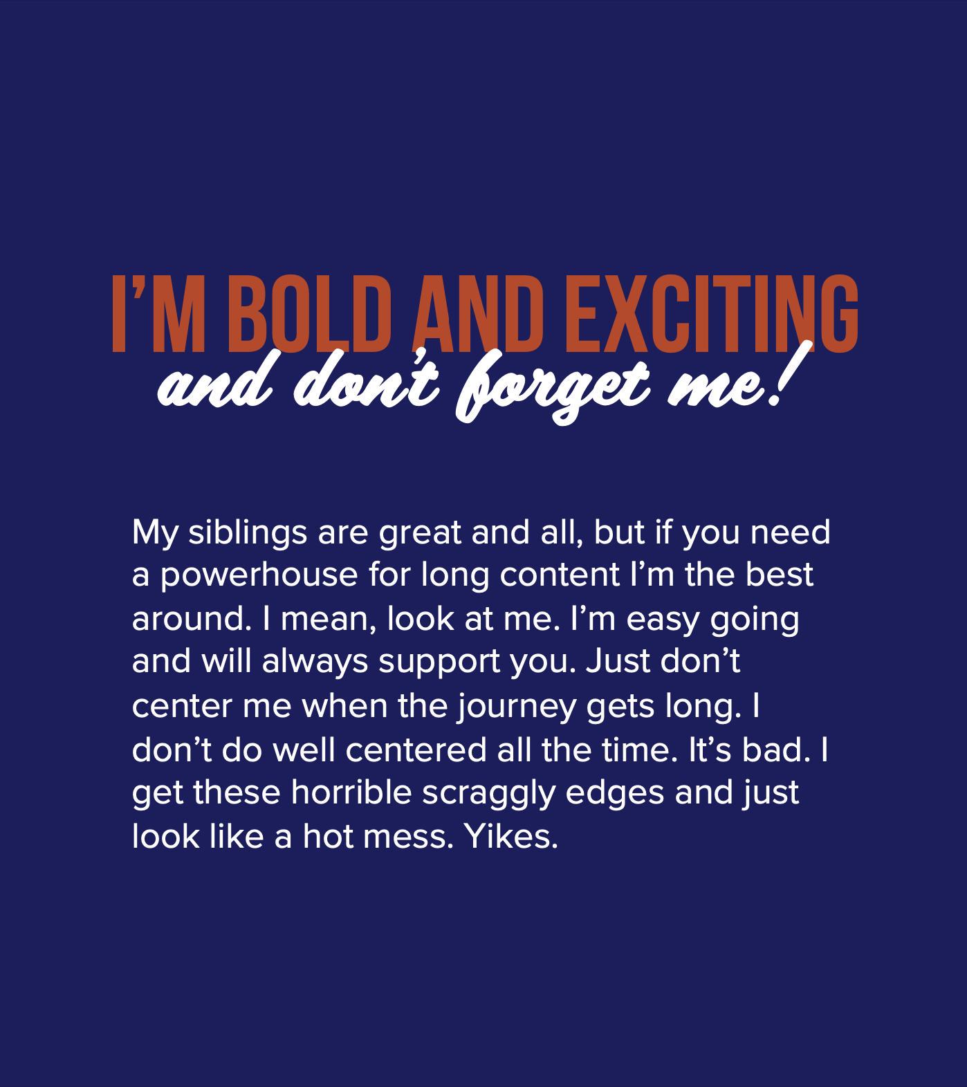
The fonts didn’t change, but they have received some extra attention. Bebas Neue provided a bold all caps font that pairs nicely with Scriptorama in its all lower case option. Since both of those can be harder for people to read they are used sparingly. To make sure all important content, especially blog content, is legible Proxima Nova is the main body copy. All three work well together, but all can stand on their own if needed.
imagery
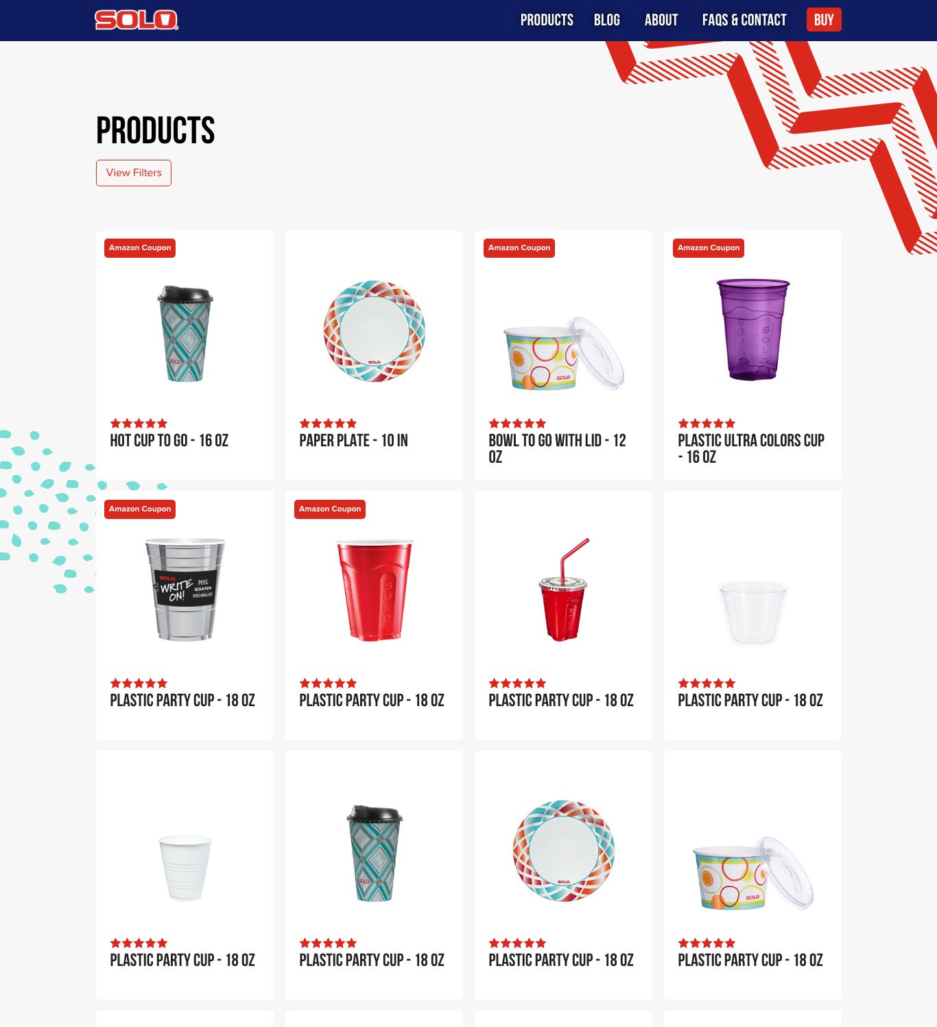
As for the imagery, the product-focused images move away from the more traditional assorted tabletop compilation into colored backgrounds and angled images. I rotated the images to create a sense of movement. This also adds to the playfulness of the brand.
For in-use images, they also need to enhance the good times. Since the SOLO brand includes some spontaneity in the “anyday moments” the images shouldn’t be perfect. They should be well photographed, but everything and everyone isn’t perfectly made up or polished. They’re more intimate and focus on casual fun. SOLO products make life easier to focus on all the happy moments that are perfect in their imperfection.

patterns
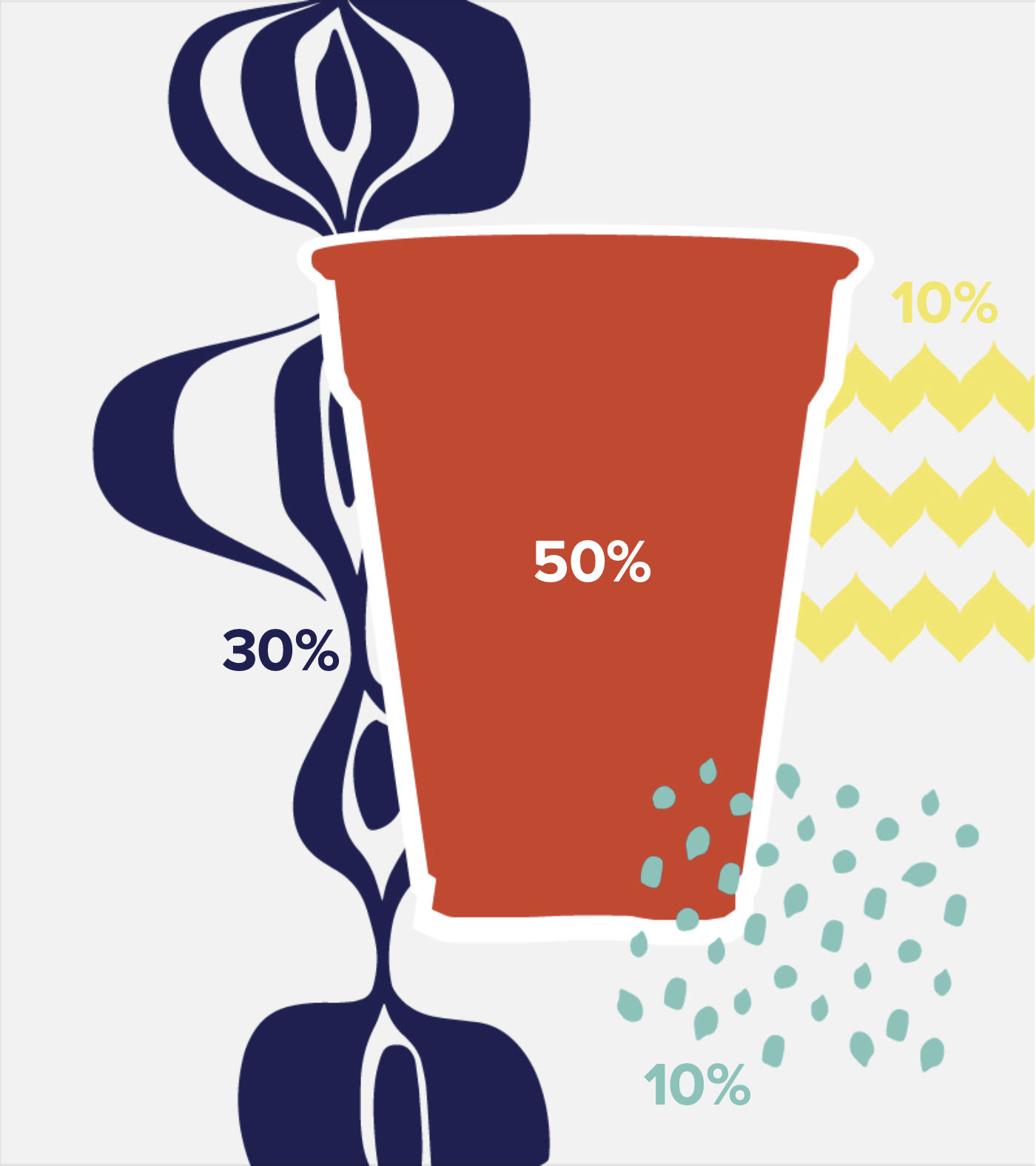
The patterns come from the products themselves with minor tweaks. The SOLO paper products get updated annually, and I thought that was an interesting feature compared to competitors. I used those patterns to build a modular pattern database. There are times when multiple patterns can be found in stores or across e-retailers, and I wanted to play up that diversity. When new patterns are created they can be added to the collection and used strategically throughout marketing channels. It’s a nod to past designs, and it’s a bonus to all the fans that notice.

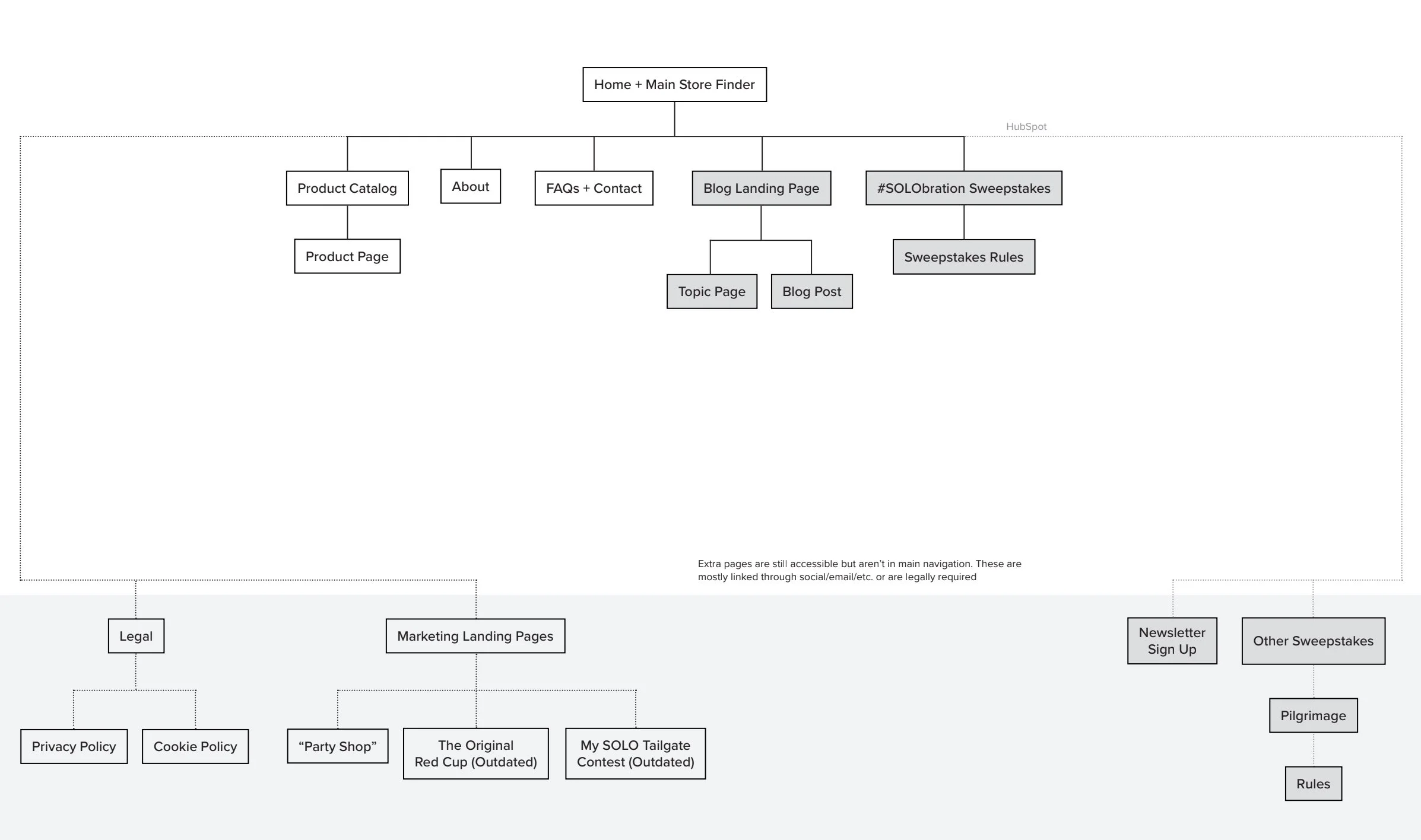
UX additions and improvements
On the UX side of this design, I should have spent more time in the initial research and evaluation phase. This was my first major jump into UX. I’ve done small tweaks on the website, but this was a drastic overhaul. There were some hurdles to overcome, and some hiccups along the way.
During wireframing, I used the content from the live site and user data from Hotjar to help develop edits to the layout. Making buying options more prominent throughout the site was a major goal. One simple solution was adding a buy link in the main navigation. It’s on all pages and the tool is robust.
One feature the site lacked was site search. One of the problems faced is the blog is housed in another service from our CMS. To save IT’s time and be more efficient and cost-effective it was determined that an outside vendor was more appropriate. The tool allows us to seamlessly search across both domains.
Overall, there are more changes to specific pages, but we don’t have all day to discuss the minute details. Other changes include adding FAQs to the contact page (using popular questions from the current contact form), using progressive disclosure to the contact form, adding “infinite” scroll to blog posts, and updates to the footer.
During the development phase, I collaborated with IT to design more efficient and detailed templates and backend infrastructure that makes updating, maintaining, and adding content easier for marketing, other designers, and admin. I wanted to make the process easier for them. To do that I asked them about their comfort level working in our CMS and what makes their jobs easier. The brand is supposed to lead people to simple and fun solutions, so I think the backend should follow suit for the content creators.
Along the way, I also presented design changes and built relationships with the SOLO CP team. They work out of a different office in another state, so this was a great opportunity to meet the people that will spend time developing marketing for the different product lines.
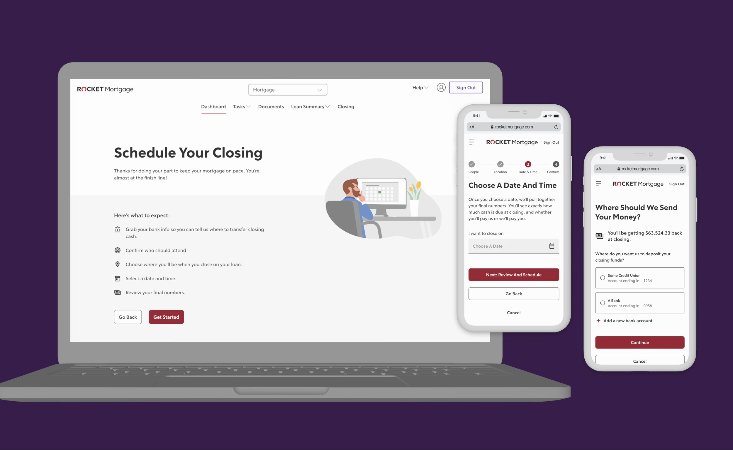
final designs
Other pages

___04
results
the work was handed off...
I didn’t get to produce the new site, with delays in the project and changes in priority I would not finish before I started a new job.
what we’ll pay attention to:
while the project is still to be picked up by technology, we did determine what metrics we wanted to pay attention to:
all the goals listed at the beginning
___05
reflections
what i would have done differently...
I should have asked more questions about features and elements needed at the beginning of the process. I did a lot of tweaks, edits, additional meetings, and changes to elements that could have been resolved in the beginning. Next time, I’ll compile a more thorough list of needs from clients before wireframes and mockups get started.
and I would have tested more of the work. I was able to test a few, but most of this was based of assumptions and personal opinion.