online schedule closing experience revamp
___01
overview
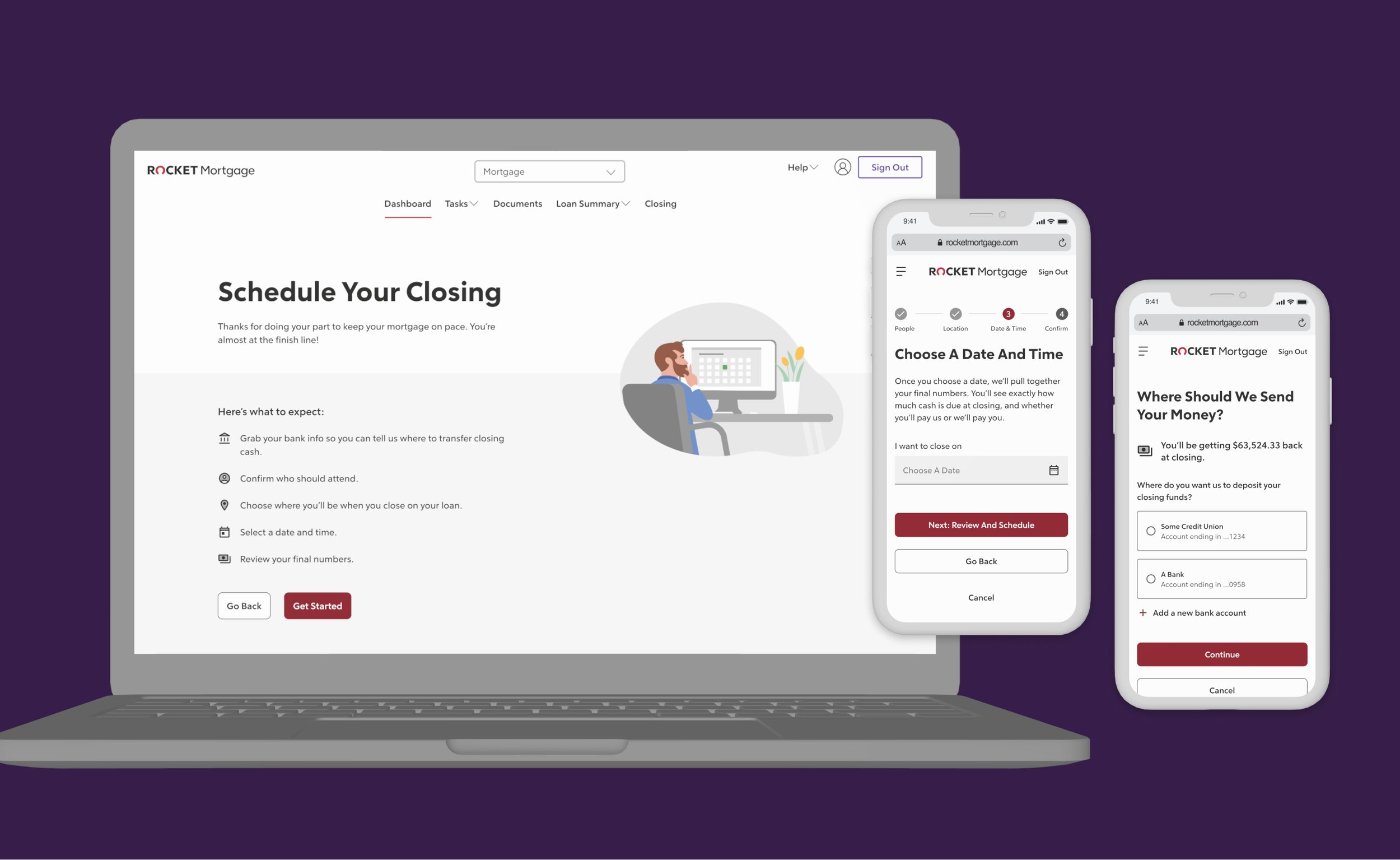
streamline and reduce fallout for Rocket’s roughly two million annual refinance clients that can schedule their closing online.
i was the lead designer and i collaborated with a content designer, a Product Manager, a tech team, and a brand illustrator.
UX Design
UI Design
Prototypes
usability test
refinance origination
rocket mortgage
one month
team
role
timeframe
client
___02
problem & goals
problem
70% of people do not schedule closing the first time they visit the scheduler.
Without any foreshadowing, people have to select the date, time, location, and choose how to pay (or get paid) all within the same flow. This forces clients to need know which bank they want to use, or know how to set up wire transfers.
Most people do not scheduling their closing within a single session, and they have to get manual follow up reminders. The longer it takes to schedule closing, the more final numbers can change, or they won’t be able to choose their preferred date.
goals
business / client
Decrease fall out between steps three (reviewing final loan numbers) and four (choosing payment and scheduling) by 10%
Increase people who complete the flow within a single visit
Have fewer closing specialists call to follow up with clients to schedule their closing
business / design
Foreshadow steps of the process to help people feel comfortable and understand what is needed when
Separate steps by appropriate information
Allow people to choose payment after saving their preferred closing date
___03
design process / decisions
flow: before
at this part of the mortgage origination process, a user has provided all the appropriate documentation and Rocket has verified it is correct. the person (or people) is now eligible to schedule their closing.
bare minimum, they need to verify the names of the people who need to attend the closing, choose a location, date and time. the date and time will determine their closing amount. the order is specific to make sure a notary is available for that preferred location.
this flow, however, makes it mandatory for someone to choose a payment option to be able to save their preferred date and time.
flow: in progress
I started by reviewing the data we had for the fallout on each step, using our internal tracking and customer survey data. The biggest fallout was between steps three (reviewing final numbers) and four (choosing payment with scheduling). through additional research.
I used that to map out the current flow with collected questions and notes about specific steps. Then I created a few user flow options to review and iterate on with the UX writer, PM, and the tech liaison.
these workshops and collaboration sessions lead to insights that i missed from my initial explorations:
there’s nothing to tell clients they’ll need to add banking information at the end of the process
there’s no way to see what date and time someone picked without going back to the second step
there’s no confirmation of date and time before scheduling closing
After a few more rounds of collaborating, and reviewing the project brief to make sure we had everything, we decided on a flow to test. the test also included questions about a couple components.
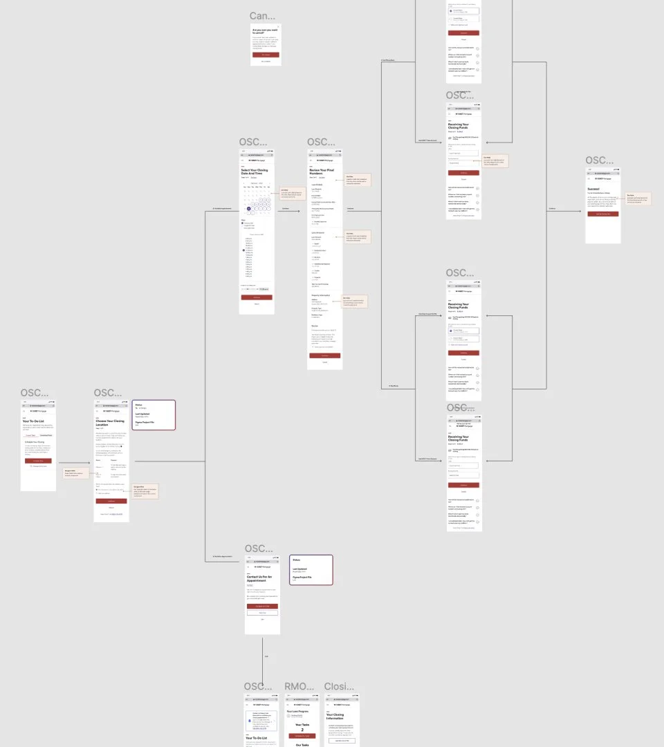
flow: after
By breaking out the payment choice into it’s own task, we believe it helps clients understand that their payment is not due at the time of scheduling. Additionally, we updated content to clarify additional information.
Even though there are a few more steps, this is closer to the story we would prefer to tell folks. This gets away from making payment a mandatory step before being able to pick and schedule a closing date. Ultimately, this will lead to decreased fallout between scheduling and payments and help with business goal one.
foreshadow banking information, this will help set better expectations to help clients complete the process in a single session
1
this was lumped into the location step, but there should be more context around the different types of attendees
2
separated out scheduling and payment, to help reduce fallout by 10%. we can still get the information for payment after
3
remind people when their closing is, but make it super simple to move forward with choosing a payment option
4
collaborating with design system team
stepper changes
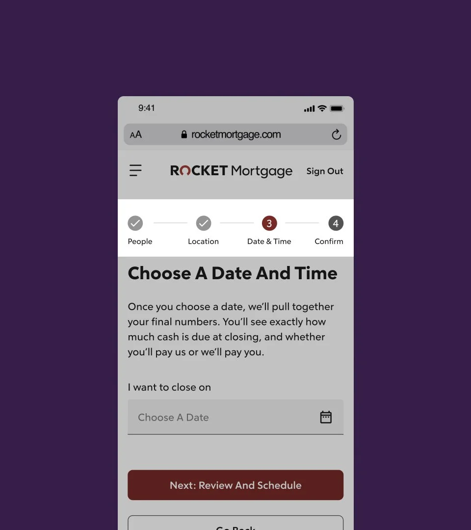
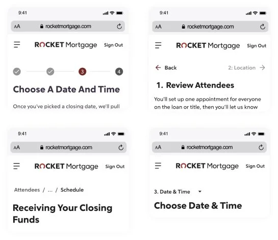
the existing design system had a generic stepper component without labels or descriptions. i was worried this component may confuse users, so i built a usability test to validate this concern.
the results of the test proved that most users were confused by the generic component, and i used those insights to iterate the design and introduce an enhancement to create clarity. this component was updated in the design system and can be used for similar use cases across the Rocket family of companies.
a few other iterations while working with the design system team
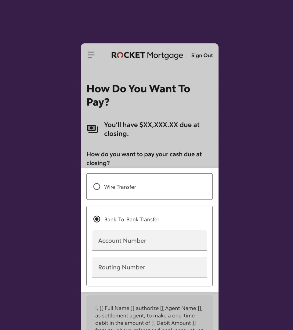
complex radios
for the payment selection process, for folks who need to pay their closing costs they have two options: wire transfer or bank-to-bank transfer. if we had a bank account from a previous transaction we can auto-populate that information. with users who don’t have that saved, we needed a way to ask about their preference.
while other options made adding an account easy with a dropdown, i needed a way to reduce noise and complexity for users. the best way, we verified with a usability test, was this “complex” radio. it shows the necessary information when someone would need it, rather than showing everything all at once.
additionally, this was added to the design system to be used for similar use cases.
file notation
I’m a fan of being able to come back to a document, or have someone be able to review my work without having to always reach out and connect.
Since this is a flow based on several logic dependencies, and it may sit in the tech backlog, I’d rather provide a little too much information to re-aligned and up to speed. You can see from the screenshot that there are places for tech notations.
Additional pages in my Figma include context around decisions and usability testing.
final prototype
___04
results
the work was handed off...
we spent time to work with the technology team to review the file, answer any design questions, and gain alignment on next steps. due to shifts in business priorities, this project’s build and launch was delayed.
what we’ll pay attention to:
while the project is still to be picked up by technology, we did determine what metrics we wanted to pay attention to:
decreased fallout between the first steps, before choosing payment
fewer calls to the closing care specialists about scheduling
if the separate tasks make a difference in broader fallout
___05
reflections
if i had more time...
i would have preferred to work with a researcher to understand more about how clients choose their date and time. i think there is something beneficial about being able to make it easier for people to pick a date from a few common options rather than having them go through an entire calendar to pick.
i would have also been interested in learning if having a date helped people finish tasks quicker. for example, if someone chose a date at the beginning of their mortgage process, would they provide information quicker knowing how it affects their closing date?
what i would have done differently...
i would have tested other lo-fi flow options more. i used data from previous tests to help structure the one we tested and iterated on, but i think it would have been interesting to try other ideas at the lo-fi stage.
