appraisal cash out
___01
overview
provide a digital solution for people who were taking a cash out refinance to determine if they wanted to use their new equity
UI / Visual Design
Prototypes
refinance origination
Rocket Mortgage
two weeks
team
role
timeframe
client
___02
opportunity & goals
opportunity
during the height of the pandemic, when rates were low and home values increased there was the opportunity for people to use their new equity to make different financial decisions with this new opportunity.
we heard from people who took a cash out refinance—and their appraisal came back higher—wanted an easy and digital way to understand their options.
goals
business / client
Safely increase the value of loans being taken out
Decrease manual calls to clients to see if they were interested in this option
business / design
Use their new equity in ways they deemed fit, common examples were:
Make renovations to their home
Pay off additional debts
keep the new equity for a rainy day fund
Understand their options without feeling obligated or pressured to make a decision on the phone with a random person
___03
design process / decisions
I was the UI/Visual Design side of the process. While I collaborated with the Senior UX Designer during the initial workshops and discovery work to understand the opportunity space, most of my efforts were spent on creating the UI and prototypes for testing.
Collaborating with UX
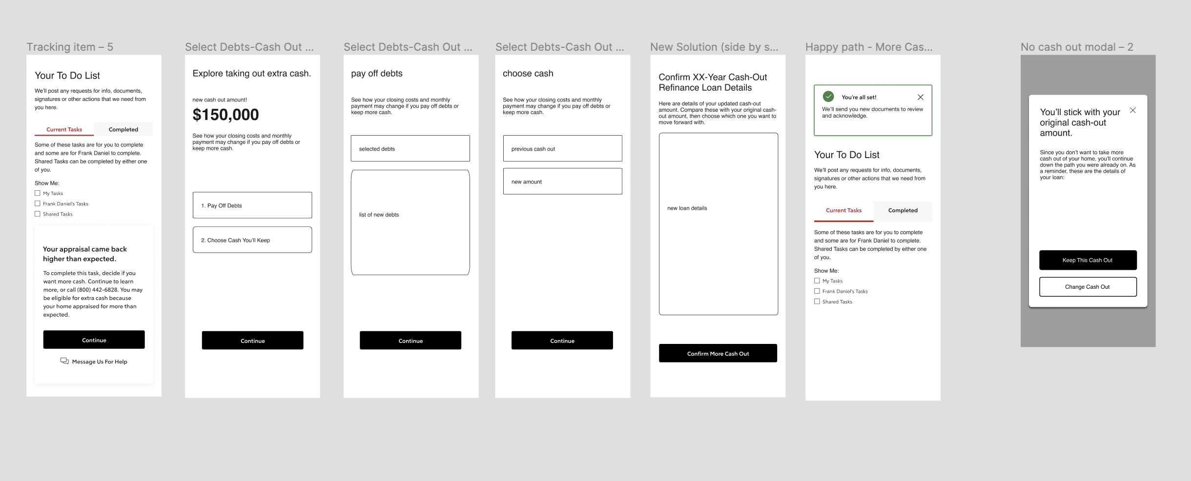
These were the initial wireframes that the UX Designer provided for me to get started. From these I scheduled some time with her to understand her flow and how she came to these ideas.
After a few ideation sessions and working through the designs there were a few things I noticed that needed to be addressed:
How to show someone how much cash they had left to play around with
Full amount left vs what they could actually take out
Make it as easy as possibly for someone to leave the experience
What was the appraisal amount?
Limitations
couldn’t dynamically show new loan figures
couldn’t remove previously selected debts online
couldn’t change the term length online
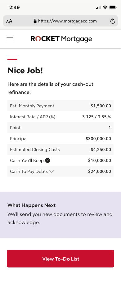
With some conversations with engineering, we determined we couldn’t have a dynamic view of a client's new mortgage numbers. The usability tests showed most people correctly understood the manual version.
However, there was a common theme among the testers: they would have preferred to play around with the numbers without having to remember/write down the different mortgage changes.
And people couldn’t remove previously selected debts digitally, could only add new ones. That would still need to be manually adjusted with a person over the phone. We took this opportunity to add this in as a new feature in the backlog.
Working with the design system team
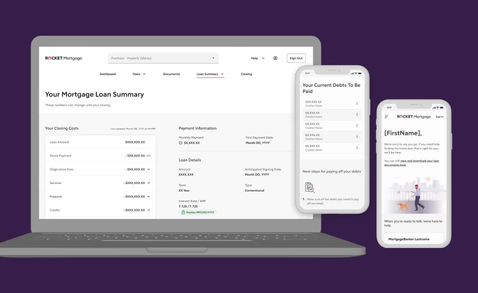
After that I worked with the Rocket Design system to see what components I could use as-is. Since the design system was still in its infancy stage, there were a few components that would need some tweaks to work for this specific use case. I collaborated with a couple of the designers on that team to help me understand the accessibility and how they would need to fit into the new platform.
final designs
___04
results
multiphase iteration...
It turned into a multiphased initiative. While the backend was being built out and connected to the appropriate systems, we needed an even easier MVP.
The initial phase, creating a task item that allowed clients to digitally select their interest went well. Interest rates were down, and people wanted to take cash out to make changes to their homes. This was a great opportunity for people to build more equity or pay off debts they originally couldn’t add into their loan.
While it served the business well to get more people to take out slightly higher loans; it didn’t help the customer care folks since they still had to manually call everyone who was interested in taking out more cash.
___05
reflections
what i would have done differently...
I would have spent a little more time connecting with the client care folks and the UX Designer to understand more of the opportunity space. At first this seemed very focused on the business making more money while not providing as much value to people who wanted a very digital experience.
I think foreshadowing some of the potential opportunities and having a dynamic cash remaining calculation would provide even further benefits to the business and clients seeking to learn more about their options.


