angular / design system transition
___01
overview
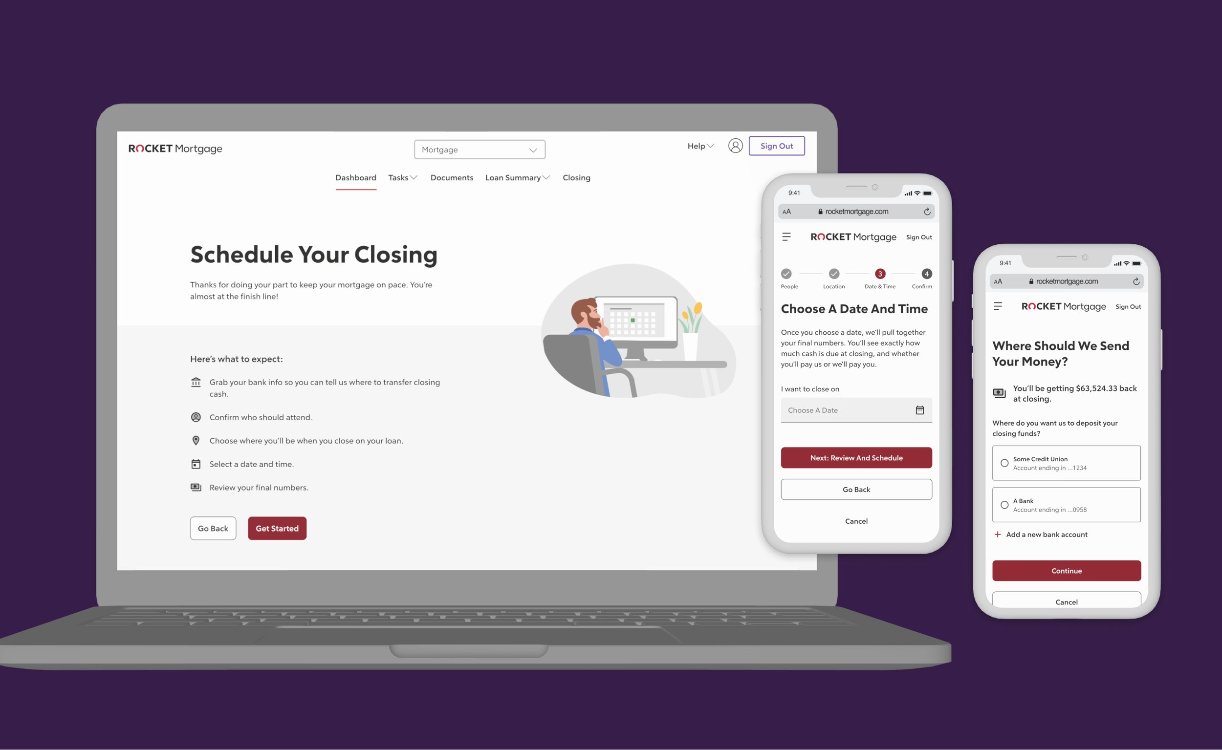
this first phase was to redesign the “miscellaneous pages” into the new design system while tech migrated the backend into Angular for updated security.
i was the lead designer and mentor to a mid-level designer. i also collaborated with a content writer, PM, tech team, and brand illustrator.
UX Design
UI Design
Prototypes
mentor
refinance origination
team
role
timeframe
client
~one month
(project had some delays with last-min business shifts)
rocket mortgage
___02
problem & goals
problem
the original feature focused on tech stack enhancements to move the codebase into Angular for better security and to implement the new design system.
these pages were defined by the technology team as the best pages to start. they were less complicated than many of the other pages, and they were the best to test the specific backend integrations.
404
500
Coming Soon
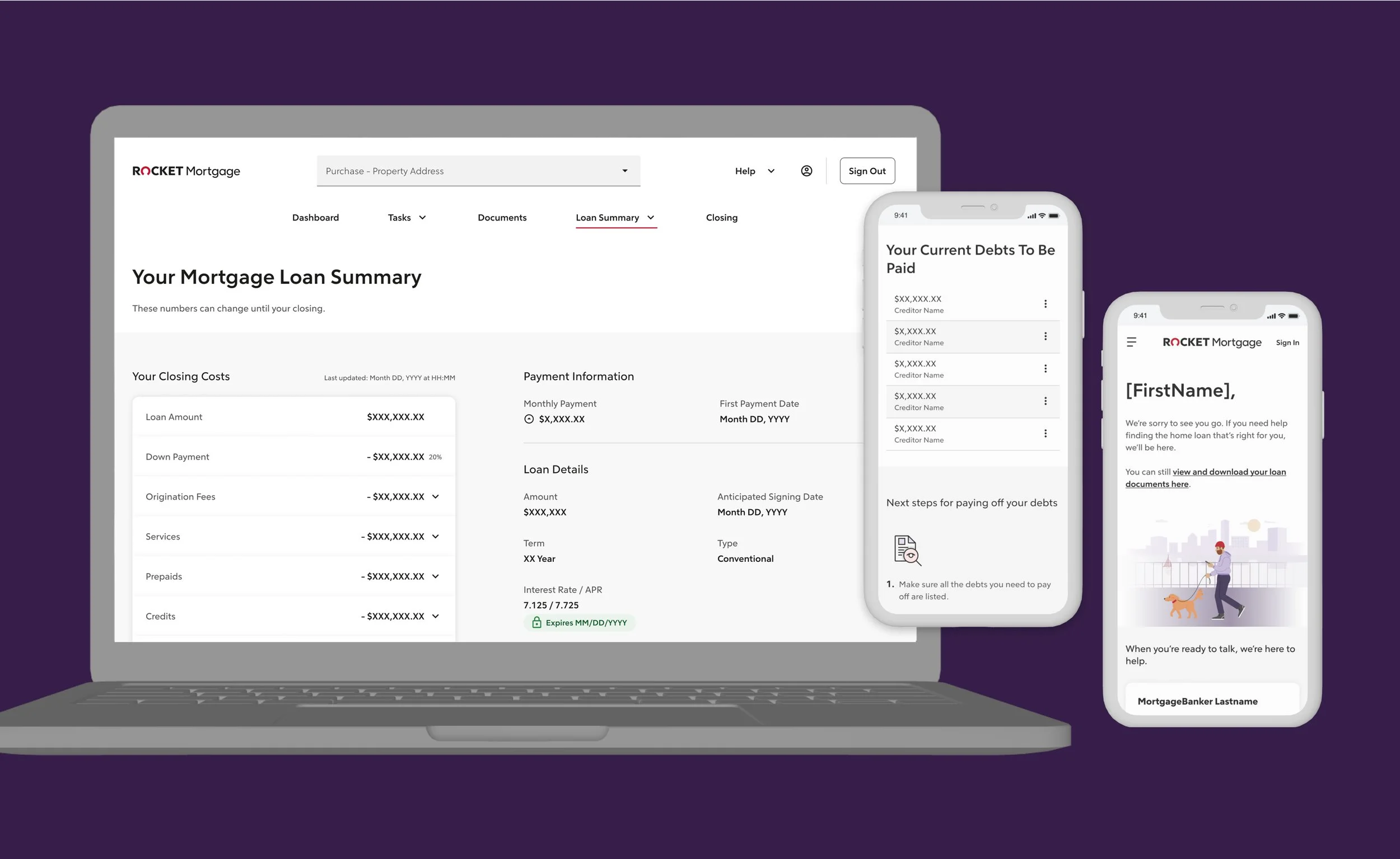
Debts To Be Paid
Denied
FAQs
Insurance & Associations
Loan Details
Screenshare
Withdrawn
goals
business / client
get the backend stack on Angular so the origination process is more secure for users
update the style to match the new design system and raise NPS
business / design
opportunity to build in small “wins” while the tech stack was overhauled
restructure content and hierarchy to help clients understand page specific information
build the backlog with product and tech
___03
design process / decisions
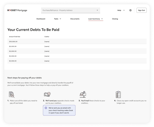
good
as close to a one-to-one redesign of the current pages. it may include minor changes for components that didn’t live in the new design system, content updates to match the new brand voice, or small visual tweaks
the “good” version included better language about this process. we get many calls from users who are confused about why they are receiving the checks rather than us mailing them to the creditor
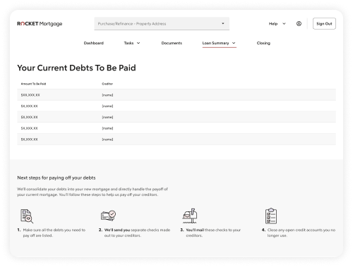
better
minor enhancements based on knowledge we already had from usability tests, research reports, or assumptions were were comfortable moving forward on
the “better” version was to let clients know when the checks were on their way, but their email would house the actual links
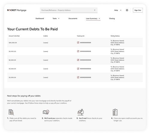
best
general idea but would potentially need more research and time to build. it was also an opportunity to collaborate on the backlog with product
clients told us they didn’t know where to mail checks, so a “best” version (but not our ideal) was to include tracking links and addresses on where to mail checks
in theory, this “good, better, best” seemed like a good idea at the time. however, I didn’t communicate this well to the other designer I was working with. it then led to misalignment, awkward conversations, and added extra time to make tweaks for all of us get to get on the same page.
note to self: always have the appropriate parties in the room!
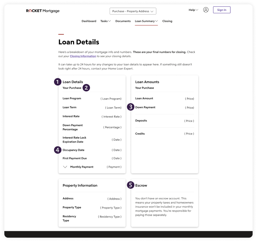
loan details: before
general layout
this is the third most visited page, and still causes clients to call about specific calculation concerns.
most people who call about this page want help to understand their closing numbers. this layout doesn’t provide any context on where to look—and purchase folks don’t even have that figure available.
there are amounts as well as property info within the Loan Details “card”.
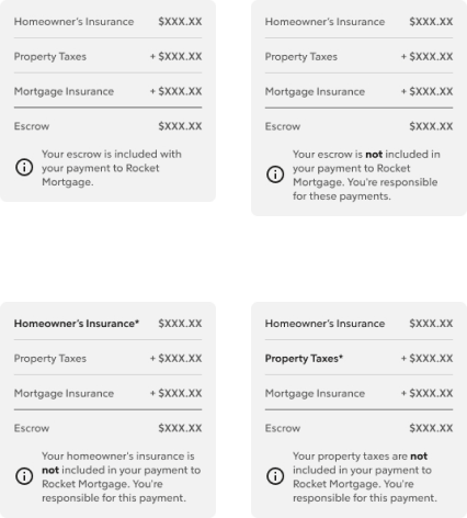
escrow is related to the monthly payment, so why is it on it’s own?
that intro is very long, especially on mobile.
1
why repeat the h1 here?
the person would know their loan type, we don’t need to remind them. and it’s also above the menu dropdowns.
2
this is the calculated version of the down payment percentage, why not have them together for someone?
3
related to property information, so it seems it should be within that section.
4
related to monthly payment, so it seems it should be near it as well.
5
loan details: in progress
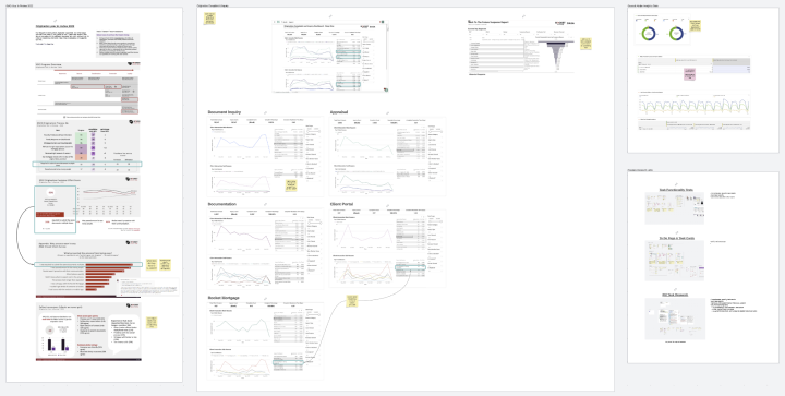
i started by collecting as much of the complaint and call-in data i could find in Rocket’s data collection tools, and reviewed studies from our research team as well. this allowed me to understand more about what people weren’t getting from their online experience or their Loan Estimate.
the biggest concerns were:
closing calculations
payment and escrow information
disbursement dates
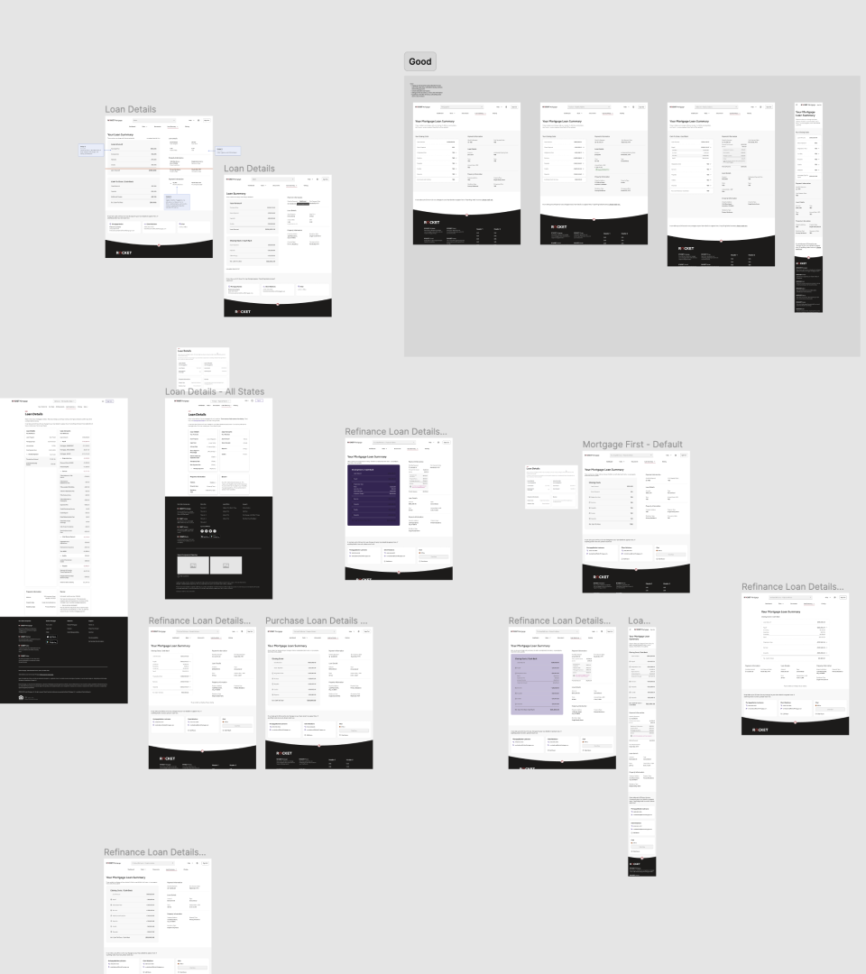
from there, i partnered with the UX writer to create several options to change the hierarchy of the content. after a few options were fleshed out, we presented them to the PM for further refinement and alignment on business goals.
screenshot of the Lucid board I used to collect and connect research findings
screenshot of my Figma file with examples of the Loan Details page
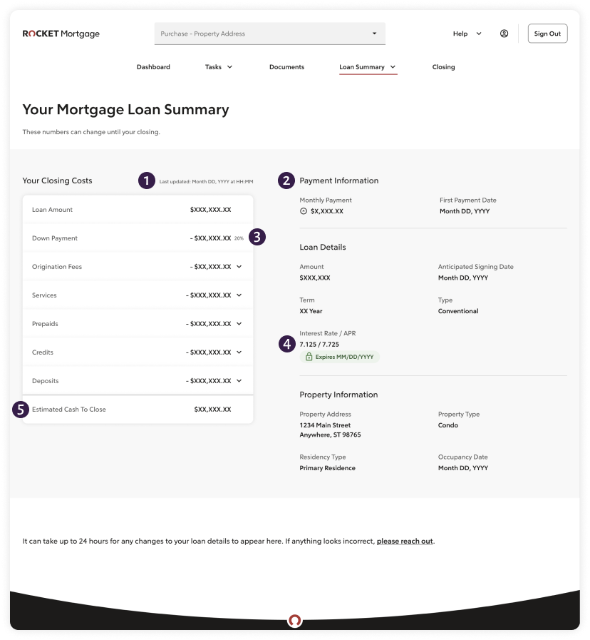
loan details: after
general layout
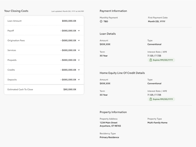
closing costs are a major reason people call to get help, so this layout focuses the information to that specific calculation first.
the figures on the left will change more frequently than the information on the right, so by using the accordions and a white background, the design focuses the eye toward the calculation.
on mobile this stacks to relate to the questions we receive based on frequency—starting from closing cost calculations down to the property information.
this also reduces visual noise by combining related information, rather than the sporadic view.
while this view is for a purchase client, there are audience specific views for refinance (rate and term and cash back) and HELOC clients as well.
show when this was updated. due to backend processing we usually refresh this once every 24 hours. we can help users get a better idea, and they won’t need to call to ask.
1
payment information is a common question people want to know, so I pulled it out and added any escrow information to it. that also reduces noise for duplicated information.
2
combined the down payment percentage with the calculated amount to reduce some of the visual noise.
3
relate the expiry date with the actual interest rate and APR, keep the context related to help users understand this figure as a whole.
4
make closing cost information a progressive calculation. this is loosely based on the layouts of a typical Loan Estimates and Closing Disclosures. the user’s mental models should be able to help them understand their loan figures better.
5
swing and a miss…but a learning moment
missed use cases
while working through the pages, we figured out where we lacked documentation about business and tech logic. there were use cases we missed until the actual developers picked up the projects.
while this lead to some edits, it also offered the chance to make sure we included the decisions and context within the broader knowledge base of the team.
what we thought were the only options for the escrow calculations dropdown
but it seems there is an option to include all but one as well
thankfully the proposed layout worked to add the missed HELOC use case with minimal extra time
final designs
___04
results
the work was handed off...
we spent time to work with the technology team to review the file, answer any design questions, and gain align on next steps. due to shifts in business priorities, this project’s build and launch was delayed.
while many of these pages are considered supplemental, several of them are important to help clients educate themselves on their financial decision. we made sure to include metrics to watch for all pages. here are a few pages.
Loan Details
decreased calls to the help center
decreased calls to bankers asking about specific numbers
actually provide the closing cost calculation to purchase clients
Debts To Be Paid
decreased calls to the help center asking about debt information
help raise NPS score
Insurance & Associations
decreased calls to users getting them to add their information
provide partner options to help people choose insurance if they don’t have any, and see if there is an increase in click though rates
___05
reflections
if i had more time...
i would have dug into the data behind specific pages and their specific audiences. i worked off assumptions and incomplete data for several pages.
i would have worked with a researcher to understand the different audiences to personalize the pages. it would be nice to have different views for refinance vs first-time homebuyers vs repeat homebuyers.
i would have also spent more time collaborating with the team member experience design team to update some of those processes. i believe there are enhancements we could make for both users and our customer care specialists with this work.
what i would have done differently...
when the project kicked off, my initial suggestion was to phase our approach by creating good, better, best versions. as we worked on the feature, there was some miscommunication within the team on this approach.
this eventually led to scope creep and designing solutions based on large and / or unverified assumptions. i would have worked closer with the PM, designers, and tech partners to make sure we documented our decisions better to avoid those unintended consequences.
additionally—and this has been a struggle for multiple features—work closer with the specific developers. they always provide additional insights that the tech liaison can miss or my notations may have missed in the documentation. since we don’t always know which team will pick up the work, it was still being iterated on.
