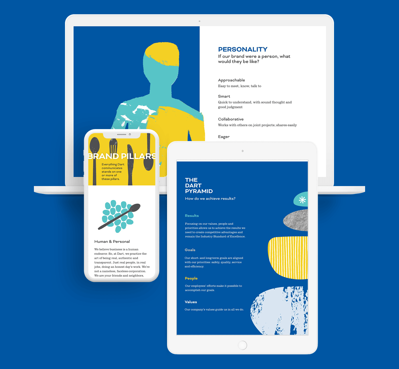
dart brand page
___01
overview
create a new branding page for Dart Container to use for communications materials
UI Design
Development
QA Testing
marketing and communication
Dart Container
two weeks
team
role
timeframe
client
___02
goals
increase interactions to the communications team email
provide guidance to internal team members about the change
___03
design process / decisions
This was a new build with a new brand. There were new fonts, colors, and graphics to present to the company and vendors. The design is meant to reflect the printed version of the brand book and save on the costs of printing almost 20,000 copies.
This was a quick design and build, so it was important to make sure the new essence of the brand wasn’t lost. I did a few wireframe sketches and quickly got to work coding the page since I knew that would take me the longest to complete.
For the wireframes, I used the square shape of the book as a starting point. Much of the printed design caters to a square and a 1:2 ratio rectangle. I wanted to showcase those details on the webpage as much as possible—even if Dart’s average users’ screen sizes aren’t those dimensions.
I had a brand style to work with, so colors and fonts were already approved and accepted. The tougher part was erasing my biases toward the current Dart brand and typical layouts. Since this new brand was not a full company-wide design changeover this page needs to educate and entertain the viewer.
As for development, the Dart website is built on the Bootstrap framework, so it was easy to continue using those classes and tweak the pieces I needed. I also used this as a time to experiment a little with the CSS properties vh and vw, mostly on desktop since the extensive page real estate lends itself to the content and shape of the brand book. Then I experimented using sticky images on one side to keep them visible while text lengths varied. I hope it keeps the viewer engaged and allows them to soak in the new visuals.
___04
reflection
In an ideal world, I would have liked to add scroll animations and screen transitions. The Dart Corporate Communications team sent me a couple of examples of brand pages they enjoyed. The examples included videos, animations, and multiple interactive pieces. I thought the examples were well done and believe they had more resources on their build. To make sure this Dart brand page rolled out on time, I made the call to have animated gifs instead of scroll animations and other pieces.

